
Interpreting risk against the WHO target
d-interpreting-risk.Rmdambre produces figures, but the real deliverable is a
decision: is this reuse scenario safe enough? This
vignette explains the benchmark, how the package gets from single
exposure events to a yearly figure, and how to read the resulting
distribution against the regulatory objective.
The objective
A reference is the World Health Organization (WHO) tolerable-risk target of
no more than 1e-6 DALY per person per year.
– one micro disability-adjusted life-year, i.e. roughly one healthy year of life lost per million exposed people per year. It underpins the WHO guidelines for wastewater reuse (2006, 2016), is the health basis behind EU Regulation 2020/741 on water reuse (with its reclaimed-water classes A-D), the French arrêté du 18 décembre 2023, and ISO 16075.
ambre’s DALY plot draws this target as a red line so you
can read acceptability at a glance. And you can adjust this target to
other regulation by changing the value of the parameter
objective in plot_dalys function.
From an event to a year
A single splash of water is a tiny risk. What matters is the
accumulated risk over a year of repeated exposures.
get_risk_total() performs that aggregation. For each
Monte-Carlo run it combines the per-event probabilities into annual ones
with the standard independent-events formula
and sums the per-event DALYs. It writes a risk_total
table with, per run:
-
infectionProb_sum– annual probability of infection,1 - prod(1 - p); -
illnessProb_sum– annual probability of illness (infection weighted by the chance it makes you ill); -
dalys_sum– the annual DALY lost, the number you compare to 1e-6.
Why the result is a distribution
Here is the point most easily missed: one row of your
scenario does not give one risk number, it gives a thousand of
them. ambre repeats the whole calculation
number_of_repeatings times (1000 by default), each time
redrawing concentrations, volumes and log-reductions from their
distributions. The index that separates these runs is
repeatID. So dalys_sum is a sample of
1000 plausible annual burdens, capturing the dispersion in the inputs.
You interpret its spread, not a single point. (For the
machinery behind this, see
vignette("g-monte-carlo-engine", package = "ambre").)
A worked example with the numbers
Let us pull the actual numbers out.
run_qmra_initial_situation() and
run_qmra_supplementary_process() run this exact chain
internally and returns only plots, so to reach the underlying table we
reproduce its steps and stop at get_risk_total():
scenario <- create_scenario(
  system.file("input_1culture_2pop.xlsx", package = "ambre")
)
scenario <- inflow_concentration(scenario, pathogenName = "Campylobacter jejuni")
scenario <- scenario |> mutate(volume = map(config, ~ simulate_exposure(config = .x)))
scenario <- initial_dose_calculation(scenario)
scenario <- update_treatment_scheme(scenario, initial_situation = TRUE)
scenario <- scenario |> mutate(log_reduction = map(config, ~ simulate_treatment(.x)))
scenario <- final_dose_calculation(scenario)
scenario <- infection_probability_calculation(scenario)
scenario <- illness_probability_calculation(scenario)
scenario <- dalys_calculation(scenario)
scenario <- get_risk_total(scenario)
Unnest the risk_total list-column and you have one row
per Monte-Carlo run:
Now read the annual DALY distribution against the target. The median, the upper tail, and – most usefully for a decision – the fraction of runs that breach 1e-6:
quantile(rt$dalys_sum, c(0.05, 0.5, 0.95))
#>           5%          50%          95%
#> 2.877638e-12 6.169565e-12 1.230318e-11
mean(rt$dalys_sum > 1e-6)     # share of Monte-Carlo runs above the WHO target
#> [1] 0
A median comfortably below 1e-6 with only a small fraction of runs above it is a very different message from a median that straddles the line: the first says “safe with margin”, the second “safe on average but not robustly”. Reporting the exceed fraction makes that distinction explicit.
Reading the DALY plot
The same information, visually, is what plot_dalys()
shows – and what run_qmra_initial_situation$dalys
run_qmra_supplementary_proocess$dalys return:
library(dplyr)
scenario_example <- create_scenario(filepath = system.file("input_1culture_2pop.xlsx", package = "ambre"))
regulation_reduction <- config_ambre$regulation$regulation_value |> filter(Country == "France") |>
                          select(-c(Concentration, Country, RegulationID))
regulation_concentration <- config_ambre$regulation$regulation_value |> filter(Country == "France") |>
                        select(-c(Country, RegulationID, Reduction))

plots <- plot_comparison_qmra_initial_vs_supplementary_processes(
  scenario = scenario_example,
  pathogen = c("Campylobacter jejuni"),
  regulationLog = regulation_reduction,
  regulationConcentration = regulation_concentration
)
plots$dalys
#> $`Campylobacter jejuni`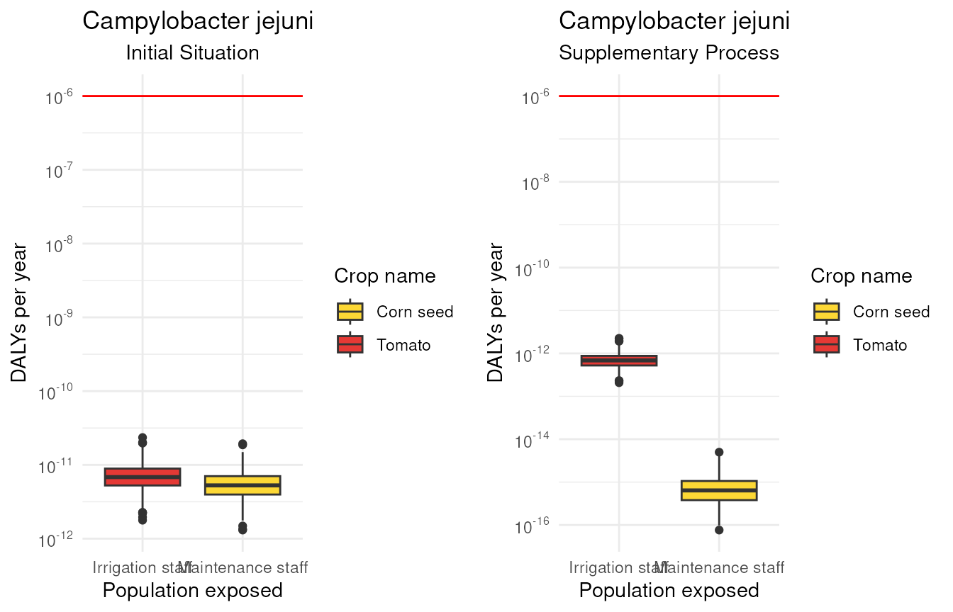
Each box is the distribution of dalys_sum for one crop x
population, on a log10 y-axis. The red line is
the 1e-6 target: a box sitting entirely below it meets the
goal; a box straddling or above it does not.
Concluding
Turn the reading into an action:
- Median and 95th percentile below 1e-6 -> the scenario meets the target; document the margin.
- The line runs through the box -> not robust. You need to cut the risk.
Two levers do that, each with its own vignette:
- reduce the pathogen concentration with more or
better barriers –
vignette("b-initial-vs-new-scenario", package = "ambre"); - reduce the exposure itself (PPE, fewer contacts) –
vignette("f-what-if-exposure", package = "ambre").